Top Tips for Choosing Colors That Boost Your Brand
A well-designed vinyl vehicle wrap is able to grab attention in an instant. When it comes to your brand, you want to make a statement with your company’s colors. It’s important that you follow these five simple tips when choosing the right colors to make your brand stand out. Color can be one of the most powerful tools in branding and marketing because it conveys emotion and meaning in an instant. You’ll also want to consider how color affects human perception and behavior – this is a key concept when it comes to evoking a particular feeling about your brand.
Choose a neutral background color
The first step when picking out colors for your business is deciding on a neutral background. This will allow other colors like text or graphics stand out more effectively against that backdrop. It also makes it easier to switch up the tone of your blog posts without having too many drastic changes.
Consider the color of your existing logo and other branding elements
You’ll want to make sure that your branding colors complement each other, so it’s important to consider the color of your logo and other branding elements. For example, if you have a blue logo, you might want to stick to cool blues and grays for your website and marketing materials.
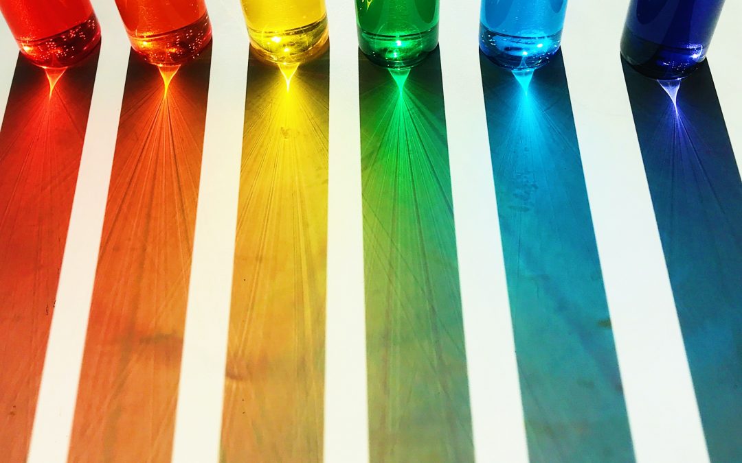
Use colors that won’t clash with each other
If you’re using more than one color, make sure they don’t clash and that they work well together. Use colors that represent your brand’s personality. As an example, if you are a pool maintenance company you may want to consider colors such as blues and greens to evoke calm feelings of water. In the case of a fitness company, using bold and energizing colors such as reds and oranges which harmonize well, would go a long way in making your branding cohesive.
Use colors that contrast and are easy to see
When people look at your branding, you want them to be able to see the content easily. Choosing colors which provide contrast such as yellow on a black background will allow all of your information to be seen more easily and at a further distance.
Pair similar colors for consistency
Pairing similar colors is a common branding strategy because it creates consistency and flow in designs. When you’re choosing colors for your vehicle wraps, stick to two or three colors that are closely related. This will help create a coherent look that reflects your brand.
Make sure that colors are appropriate for the message you’re trying to convey
As the saying goes, you can’t wear all your messages on your sleeve (or even on your car). If you’re trying to make a bold statement with the look of your car or truck, then go for it. However, if people are supposed to take something away from the design that will impact their business dealings with you, do some advance research to make sure the color you’ve chosen will get that point across.
Always test out different colors by using them in a mock-up before choosing one for a large project
Your vinyl wrap design team can provide an exact mock-up of your design in full color. A mock-up is simply creating something similar to what you want to achieve in real life, but not actually doing it. Try out different colors and be sure to run the designs by your team. Having more than one set of eyes reviewing design decisions, can assure that your final vinyl vehicle wrap reflects your brand and provides the visibility you are seeking.
Equipt Graphics has been in the business of designing and installing custom vinyl vehicle wraps for over a decade. With our state-of-the-art equipment, we can wrap your car or truck with any design you want. If you need to get rid of that old logo or just want something new on your ride, let us know! Contact us today to set up an appointment for a free consultation and estimate; we would love to work with you!